
The concept behind this project is simple but powerful: a user-centric atlas of a complex space � a unique set of maps designed to help anyone easily find the best way to their destination in Penn Station.
The need that drives this project is significant. Penn Station is a place where a huge amount of environmental information intersects with the individual needs of millions of people. Helping those people to locate and reach their goals in the most effective way means responding to diverse contexts with relevant content; a task that necessitates options, different perspectives, multiple maps � an atlas.
The New York Penn Station Atlas uses 2D diagrams and 3D models as the basis of a comprehensive set of maps that explain station layouts, pinpoint key locations, and diagram clear paths that show exactly how to get from station entrances to each of Penn�s most-used features. The contents of the completed Atlas, every map, diagram and image are intended to be available online for viewing or downloading to any computer, tablet or phone, free.
The Atlas will put simple and effective navigation tools directly into the hands of anyone who wants to know how to get from A to B in Penn Station. In practical terms, that means equipping people with maps that are best suited for the context of their needs � and context is crucial because it�s the basis of easier and deeper comprehension. For example: maps that use a heads-up approach are designed to correspond to the direction that a person is facing, inherently aligning that person with their environment [1]. In contrast, a map that uses the default tactic of positioning North at the top will result in a counterintuitive experience 75% of the time, forcing users to go through perceptual gyrations before they can actually make sense of what they�re looking at.
Using context to filter information means that a person who just wants to locate a ticket counter doesn�t have to visually sift through the entire contents of Penn Station in order to find that place. Instead The Atlas uses spotlight maps to clearly distinguish that location, the same way that it can call out any important individual feature in the station.
And because getting a grasp on the Penn environment is often impeded by its many obscured and compartmentalized areas [2], The Atlas uses models and images to provide visual context for the real spatial relationships between levels, across floors and with the exterior. As urban planner Kevin Lynch has written: �In the process of way-finding, the strategic link is the environmental image, the generalized mental picture of the exterior physical world that is held by an individual.� [3]. The Atlas will help to visualize that sometimes hard-to-see picture.
Over a half-million people use Penn Station every day. That�s more people than the total combined daily users of JFK, LaGuardia, and Newark airports. [4]
Indeed, Penn Station is the busiest transit hub in the Western Hemisphere. [5]
It�s a critical site, where basic activities like finding an exit or locating a train gate should be clear and easy. However, conditions in the Penn environment � overcrowding, low-visibility, complex layouts and fragmented wayfinding systems � amount to a perfect storm of confusion for anyone who�s not already well acquainted with the station. The result is that getting lost in Penn Station is not an uncommon experience. [6]
The impact of confused or lost Penn users has logistical implications that go beyond the frustration of those bewildered individuals. With over a half-million people per day travelling through Penn it only takes a small percentage of users to disrupt the flow of pedestrian traffic [7]. During peak travel hours, when 1,000 passengers are arriving every 90 seconds, [8] confusion can be a significant factor in station congestion. In addition to hindering traffic, confused or lost station users are likely to ask others for directions, a seemingly insignificant act that grows to an urgent magnitude when understood as a percentage of total Penn users. And notably, lost users who request directions often divert valuable station resources, like staff and security, from their real tasks, a scenario that is as troubling as it is inefficient.
Navigation-related stresses on the people and systems in Penn have been entrenched for years, but that doesn�t mean we can�t do something to help now. The New York Penn Station Atlas can help to make a challenging situation more manageable.
1. Klippel, A., Freksa, C., & Winter, S. (2006). You-are-here maps in emergencies � The danger of getting lost. Journal of Spatial Science, 51 (1), pp.117_131
�The relations LEFT and RIGHT are the same in the looked at map and in the viewed environment fostering the establishment of a correspondence� Examples of large, successful implementations include the Legible London urban wayfinding program designed by Applied Information Group, http://appliedwayfinding.com/legible-london/ and the WalkNYC urban wayfinding program designed by PentaCityGroup http://www.pentacitygroup.com/
2. �It’s claustrophobic� Jeff Gerlach, head of Amtrak Northeast Corridor Capital Planning. http://www.crainsnewyork.com/article/20140525/HOSPITALITY_TOURISM/140529915/penn-station-landlord-tells-fast-food-joints-to-go
�a maze-like station�
http://www.nj.com/news/index.ssf/2013/11/how_to_squeeze_1200_trains_a_day_into_americas_busiest_transit_hub.html#incart_m-rpt-1
�cramped and labyrinthine�
http://www.nytimes.com/2013/02/05/nyregion/new-proposal-for-transforming-penn-station.html
3. Lynch, Kevin A.
4. Regional Planning Association
5. Ibid RPA
6. �Lost in Penn Station�
7. �of the 430,000 people that use Penn Station every day, only 30,000 of them are novice users� Bob Previdi, former spokesman and operations planner for New York City Transit, http://www.nj.com, November 14, 2013. Since this 2013 article was published accepted stats now put Penn daily usage at well over 500,00 people. By extension, the novice number will have also increased.
8. �(T)he busiest station in North America, funneling 600,000 passengers through just 21 tracks, sometimes at the rate of 1,000 people every 90 seconds.� This from a 1994 NY Times story. With an additional two decades of steady regional growth since that publication date that number has undoubtedly increased.
http://www.nytimes.com/1994/06/03/nyregion/computer-to-aid-penn-station-trains.html
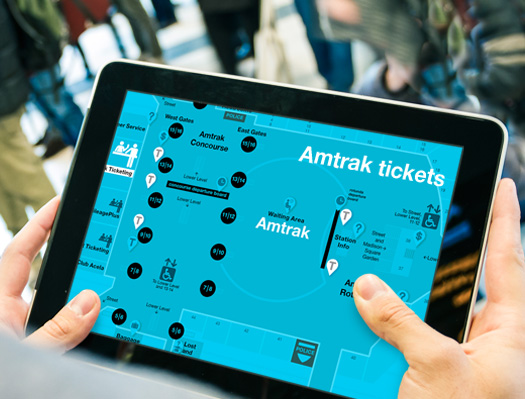
Spotlight maps can instantly call out key features, like Amtrak ticketing.
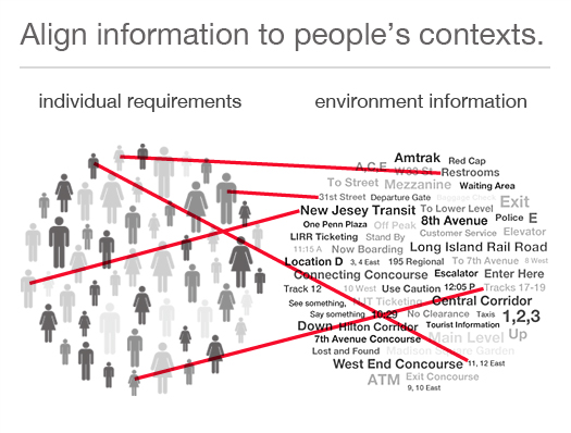
Context mapping is an underlying basis for the visual maps in this project.
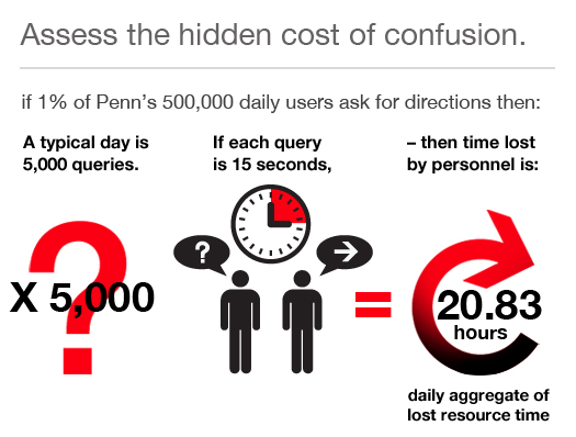
Simple math for a complex issue: lost/confused users = lost personnel time.
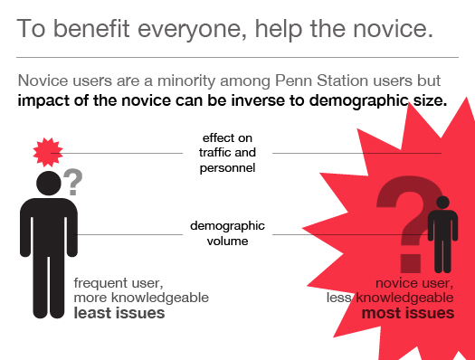
Underserving the novice user can increase challenges for everyone in Penn.
© 2015 John Schettino. All rights reserved. www.JohnSchettinoDesign.com